Uncanny Valley
About the exhibition
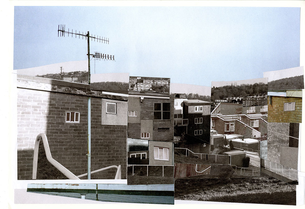
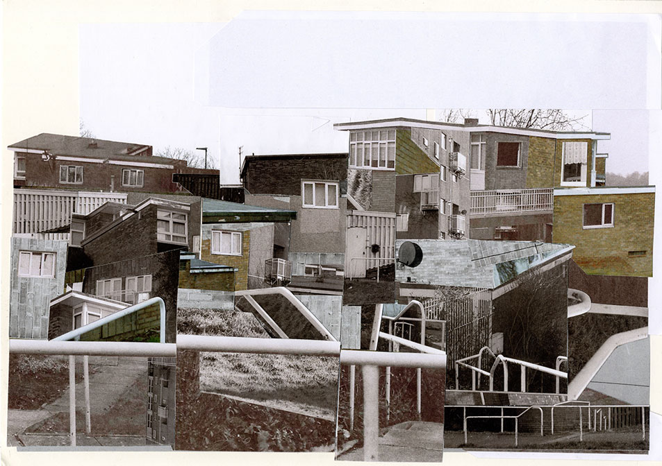
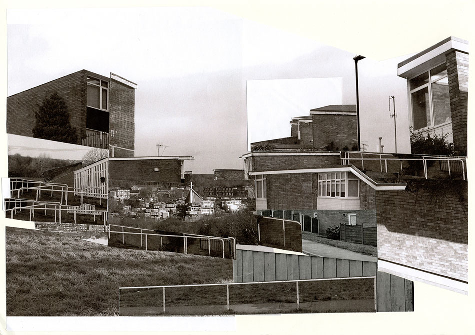
Uncanny Valley was an exhibition of photographic images taken at the Gleadless Valley estate, Sheffield. Gleadless Valley is a post-WWII Sheffield housing development. The aim of this and other estates built under the same scheme was to make Sheffield into “…an ever changing City emerging into a richer future” (Warman, 1969). Architecturally, Gleadless Valley is not dissimilar to others around the country, but the unusual valley where the estate sits makes it unique. Whilst estates designed by the same architectural practice have been critically acclaimed and redeveloped, Gleadless Valley, is on the periphery of the city and any consideration. Still without regeneration, it has been described as the city’s worst area to live (Thestar.co.uk, 2008).
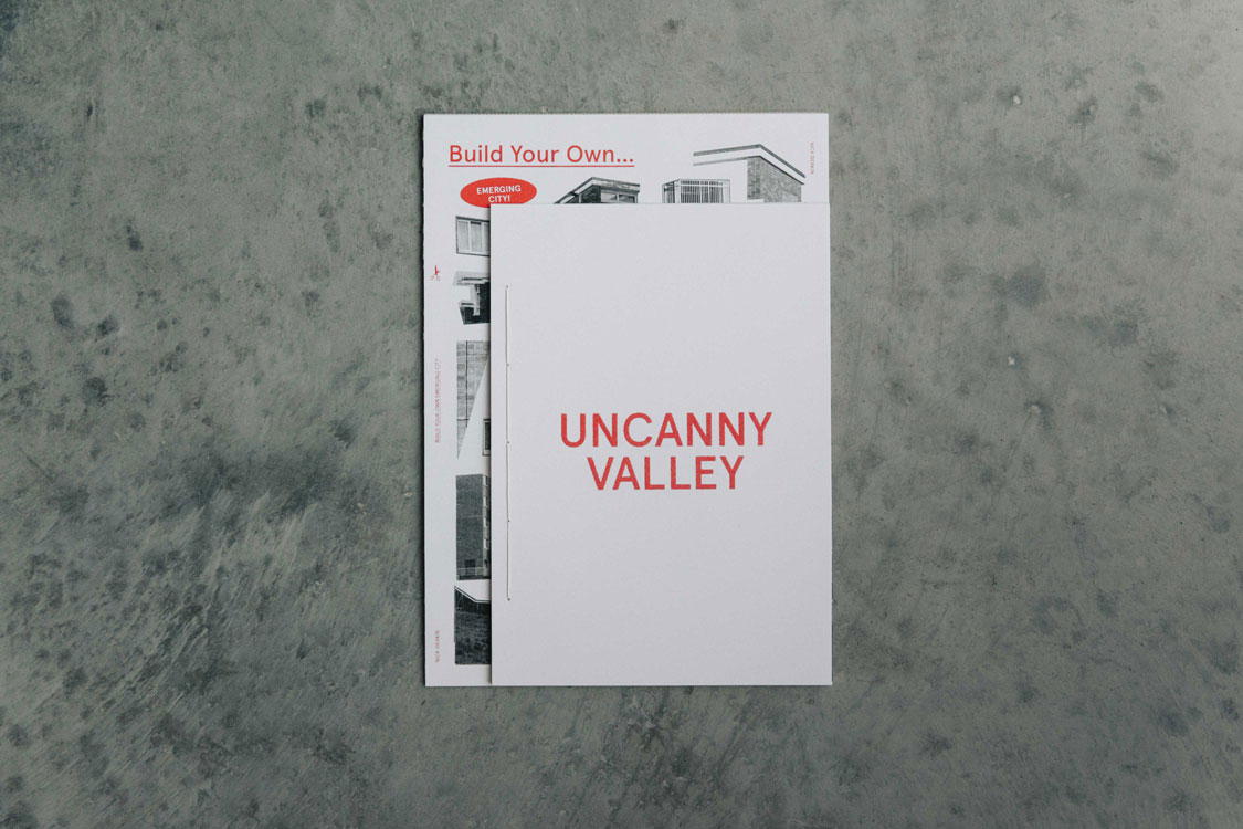
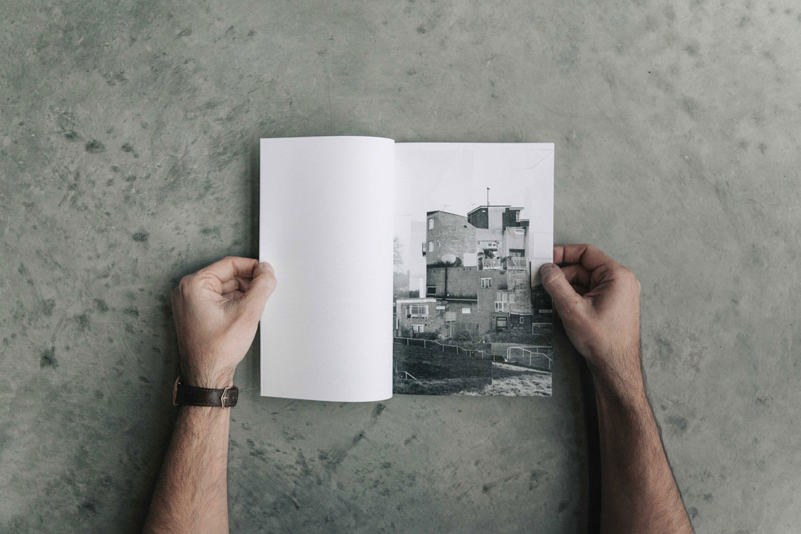
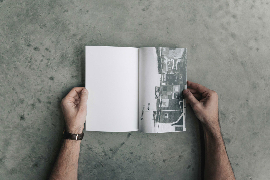
The exhibition showcased photographic montages produced by Nick Deakin, using his own images and those of photographers Richard Mulhearn and James O’Hara. The compositions repeat the lyrics of the estate — the hand rails, television aerials, windows, balconies, satellite dishes — and reinterpret them as a ‘reality of fictions’. These new fictions make the estate’s aesthetic potential tangible. The images recover the uncanniness experienced on first seeing the estate, before being smoothed by familiarity, habit and normalisation. The exhibition was accompanied by a limited edition artists’ book.
Warman, C. (1969). Sheffield Emerging City. Sheffield: City Engineer and Surveyor and Town Planning Office, p.3.
Thestar.co.uk. (2008). Is this Sheffield’s worst estate?. [online] Available at: https://www.thestar.co.uk/whats-on/out-and-about/is-this-sheffield-s-worst-estate-1-233897
About the researcher
Nick Deakin has been working commercially as an independent illustrator and graphic designer for fifteen years and is a Lecturer in Graphic Design and Animation at University of Huddersfield. Deakin’s practice and research focuses on print and screen based narratives, considering the endurance of the image through digital and analogue networks, as well as the plurality and indefiniteness of the encountered situated image.
Deakin’s work interrogates both the structure of imagery itself and the potential of co-authorship. He reveals how graphic design can sit between a long form essay and a fiction in communicating the experience of place. Deakin writes,
the image has its own unique qualities, as commodity, process, and abstraction, and it exists in conditions of digital and analogue frictions and fractured temporalities. These media are considered to exist in a contemporary composition of fractured time and space which frames the assumed ontological condition in the ideologies of an accelerated visual culture.
Deakin’s practice research also considers the emergent qualities in encountering the image situated in the mundanity of an everyday realism. These themes underpin his commercial work which develops simple and bold visual languages using typography, graphics, illustration, and photography.
Nick Deakin has exhibited worldwide and produced work for clients such as Coca Cola, Nike, The Guardian, Shell, New York Times, and The Hepworth, Wakefield. His commercial practice is conducted under the studio moniker Totally Okay.
